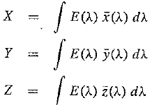
Light and Spectra
Recall from high school that light is an electromagnetic wave and that its color is characterized by the wavelength of the wave. Laser light consists of a single wavelength — for example, a ruby laser produces a bright, scarlet beam. So if we were to plot the light intensity versus wavelength, we would see a spike at the appropriate red wavelength and no other contribution to the light.
In contrast, most light sources produce contributions over many wavelengths. Humans cannot detect all light — just contributions that fall in the visible wavelength. Short wavelengths produce a blue sensation, and long wavelengths produce a red one.
We measure visible light using a device called a spectrophotometer, by reflecting light from a diffraction grating (a ruled surface) that spreads out the different wavelengths, much as a prism does. If you have ever looked through a prism, you will have noticed that it generates a rainbow effect, due to a natural phenomenon called dispersion. You see a similar effect on the surface of a soap bubble.
Visible light is an electromagnetic wave in the range 400 – 700 nm (where nm stands for nanometer, or 10^9 meter). The next figure shows the relative power in each wavelength interval for typical outdoor light on a sunny day. This type of curve, called a spectral power distribution (SPD), or spectrum, shows the relative amount of light energy (electromagnetic signal) at each wavelength. The symbol for wavelength is X, so this type of curve might be called E(X).
In practice, measurements are used that effectively sum up voltage in a small wavelength range, say 5 or 10 nanometers, so such plots usually consist of segments joining function values every 10 nanometers. This means also that such profiles are actually stored as vectors. Below, however, we show equations that treat E(k) as a continuous function, although in reality, integrals are calculated using sums.
Spectral power distribution of daylight
Human Vision
The eye works like a camera, with the lens focusing an image onto the retina (upside – down and left – right reversed). The retina consists of an array of rods and three kinds of cones, so named because of their shape. The rods come into play when light levels are low and produce an image in shades of gray (“At night, all cats are gray!”). For higher light levels, the cones each produce a signal. Because of their differing pigments, the three kinds of cones are most sensitive to red (R), green (G), and blue {B) light.
Higher light levels result in more neurons firing, but just what happens in the brain further down the pipeline is the subject of much debate. However, it seems likely that the brain makes use of differences R ~ Gt G – B, and B – Rt as well as combining all of R, G, and B into a high – light – level achromatic channel (and thus we can say that the brain is good at algebra).
Spectral Sensitivity of the Eye
The eye is most sensitive to light in the middle of the visible spectrum. Like the SPD profile of a light source for receptors we show the relative sensitivity as a function of wavelength. The blue receptor sensitivity is not shown to scale, because it is much smaller than the curves for red or green. Blue is a late addition in evolution (and, statistically, is the favorite color of humans, regardless of nationality — perhaps for this reason: blue is a bit surprising!). The following figure shows the overall sensitivity as a dashed line, called the luminous – efficiency function. It is usually denoted V(X) and is the sum of the response curves to red, green, and blue.
The rods are sensitive to a broad range of wavelengths, but produce a signal that generates the perception of the black – white scale only. The rod sensitivity curve looks like the luminous – efficiency function V {X) but is shifted somewhat to the red end of the spectrum.
Cone sensitivities: R, G, and B cones, and luminous – efficiency curve V(X)
The eye has about 6 million cones, but the proportions of R, G, and B cones are different. They likely are present in the ratios 40:20:1. So the achromatic channel produced by the cones is thus something like 2R + G + 5 / 20.
These spectral sensitivity functions are usually denoted by some other letters than R, G, and B, so here let us denote them by the vector function q (A.), with components
That is, there are three sensors (a vector index k = 1..3 therefore applies), and each is a function of wavelength.
The response in each color channel in the eye is proportional to the number of neurons firing. For the red channel, any light falling anywhere in the nonzero part of the red cone function in the above figure will generate some response. So the total response of the red channel is the sum over all the light falling on the retina to which the red cone is sensitive, weighted by the sensitivity at that wavelength. Again thinking of these sensitivities as continuous functions, we can succinctly write down this idea in the form of an integral:
Since the signal transmitted consists of three numbers, colors form a three – dimensional vector space.
Image Formation
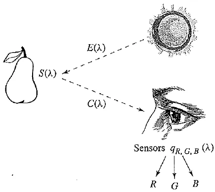
Equation above actually applies only when we view a self – luminous object (i.e., a light). In most situations, we image light reflected from a surface. Surfaces reflect different amounts of light at different wavelengths, and dark surfaces reflect less energy than light surfaces.
The image formation situation is thus as follows: light from the illuminant with SPD E(X) impinges on a surface, with surface spectral reflectance function S(X), is reflected, and is then filtered by the eye’s cone functions q (X). The function C(A) is called the color signal and is the product of the illuminant E(X) and the reflectance S(X): C(X) = E(X) S(X).
Surface spectral reflectance functions S(X) for two objects
Camera Systems
Now, we humans develop camera systems in a similar fashion. A good camera has three signals produced at each pixel location (corresponding to a retinal position). Analog signals are converted to digital, truncated to integers, and stored. If the precision used is 8 – bit, the maximum value for any of R, G, B is 255, and the minimum is 0.
However, the light entering the eye of the computer user is what the screen emits — the screen is essentially a self – luminous source. Therefore, we need to know the light E(k) entering the eye.
Image formation model
Gamma encoding
Gamma encoding of images is required to compensate for properties of human vision, to maximize the use of the bits or bandwidth relative to how humans perceive light and color. Human vision under common illumination conditions (not pitch black or blindingly bright) follows an approximate gamma or power function. If images are not gamma encoded, they allocate too many bits or too much bandwidth to highlights that humans cannot differentiate, and too few bits / bandwidth to shadow values that humans are sensitive to and would require more bits / bandwidth to maintain the same visual quality. Gamma encoding of floating point images is not required (and may be counter productive) because the floating point format already provides a pseudo – logarithmic encoding.
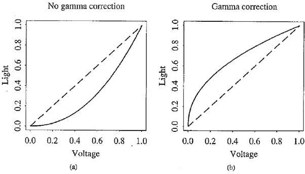
Common misconception is that gamma encoding was developed to compensate for the input – output characteristic of cathode ray tube (CRT) displays. In CRT displays the electron – gun current, and thus light intensity, varies nonlinearly with the applied anode voltage. Altering the input signal by gamma compression can cancel this nonlinearity, such that the output picture has the intended luminance.
However, the gamma characteristics of the display device do not play a factor in the gamma encoding of images and video — they need gamma encoding to maximize the visual quality of the signal, regardless of the gamma characteristics of the display device. The similarity of CRT physics to the inverse of gamma encoding needed for video transmission was a combination of luck and engineering which simplified the electronics in early television sets.
Effect of gamma correction: (a) no gamma correction — effect of CRT on light emitted from screen (voltage is normalized to range 0.. 1); (b) gamma correction of signal
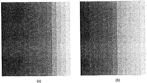
Effect of gamma correction: (a) display of ramp from 0 to 255, with no gamma correction; (b) image with gamma correction applied
This is called a camera transfer function, and the above law is recommended by the Society of Motion Picture and Television Engineers (SMPTE) as standard SMPTE – 170M.
Why a gamma of 2.2? In fact, this value does not produce a final power law of 1.0. The history of this number is buried in decisions of the National Television System Committee of the U.S.A. (NTSC) when TV was invented. The power law for color receivers may in actuality be closer to 2.8. However, if we compensate for only about 2.2 of this power law, we arrive at an overall value of about 1.25 instead of 1.0. The idea was that in viewing conditions with a dim surround, such an overall gamma produces more pleasing images, albeit with color errors — darker colors are made even darker, and also the eye – brain system changes the relative contrast of light and dark colors.
With the advent of CRT – based computer systems, the situation has become even more interesting. The camera may or may not have inserted gamma correction; software may write the image file using some gamma; software may decode expecting some (other) gamma; the image is stored in a frame buffer, and it is common to provide a lookup table for gamma in the frame buffer. After all, if we generate images using computer graphics, no gamma is applied, but a gamma is still necessary to precompensate for the display.
It makes sense, then, to define an overall “system” gamma that takes into account all such transformations. Unfortunately, we must often simply guess at the overall gamma. Adobe Photoshop allows us to try different gamma values. For WWW publishing, it is important to know that a Macintosh does gamma correction in its graphics card, with a gamma of 1.8. SGI machines expect a gamma of 1.4, and most PCs or Suns do no extra gamma correction and likely have a display gamma of about 2.5. Therefore, for the most common machines, it might make sense to gamma – correct images at the average of Macintosh and PC values, or about 2.1.
However, most practitioners might use a value of 2.4, adopted by the sRGB group. A new “standard” RGB for WWW applications called sRGB, to be included in all future HTML standards, defines a standard modeling of typical light levels and monitor conditions and is (more or less) “device – independent color space for the Internet”.
An issue related to gamma correction is the decision of just what intensity levels will be represented by what bit
patterns in the pixel values in a file. The eye is most sensitive to ratios of intensity levels rather than absolute intensities. This means that the brighter the light, the greater must be the change in light level for the change to be perceived.
If we had precise control over what bits represented what intensities, it would make sense to code intensities logarithmically for maximum usage of the bits available. However, it is most likely that images or videos we encounter have no nonlinear encoding of bit levels but have indeed been produced by a camcorder or are for broadcast TV.
Color – Matching Functions
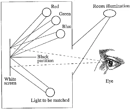
Practically speaking, many color applications involve specifying and re – creating a particular desired color. Suppose you wish to duplicate a particular shade on the screen, or a particular shade of dyed cloth. Over many years, even before the eye – sensitivity curves were known, a technique evolved in psychology for matching a combination of basic R, G, and B lights to a given shade. A particular set of three basic lights was available, called the set of color primaries.
To match a given shade, a set of observers was asked to separately adjust the brightness of the three primaries using a set of controls, until the resulting spot of light most closely matched the desired color. The following figure shows the basic situation. A device for carrying out such an experiment is called a colorimeter.
The international standards body for color, the Commission Internationale de L’Eclairage (CIE), pooled all such data in 1931, in a set of curves called the color – matching functions.
They used color primaries with peaks at 440, 545, and 580 nanometers. Suppose, instead of a swatch of cloth, you were interested in matching a given wavelength of laser (i.e., monochromatic) light. Then the color – matching experiments are summarized by a statement of the proportion of the color primaries needed for each individual narrow – band wavelength of light. General lights are then matched by a linear combination of single wavelength results.
Colorimeter experiment
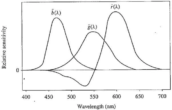
The CIE color – matching curves, denoted r(X), g(X), b(X). In fact, such curves are a linear matrix – multiplication away from the eye sensitivities inCone sensitivities: R, G, and B cones, and luminous – efficiency curve V(X)
CIE color-matching functions r(A), g(X), b(X)
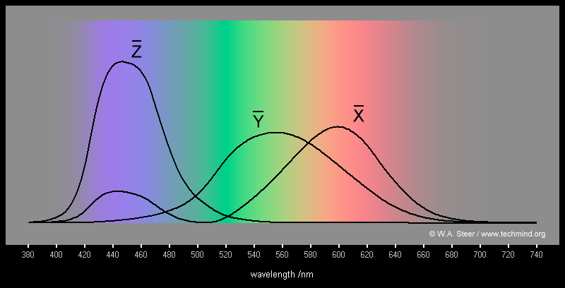
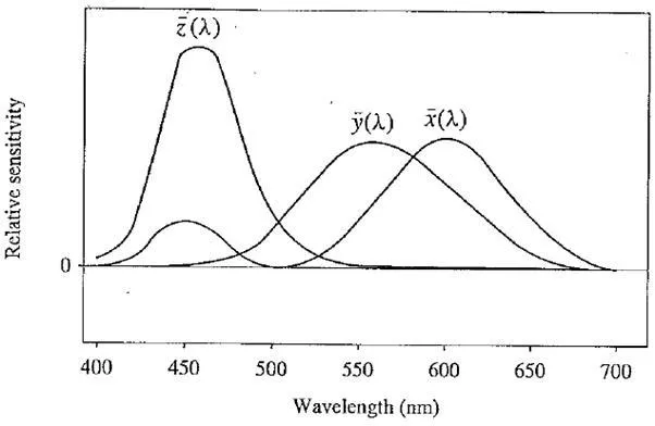
CIE standard color – matching functions x(k), y(k), 1(1)
Why are some parts of the curves negative? This indicates that some colors cannot be reproduced by a linear combination of the primaries. For such colors, one or more of the primary lights has to be shifted from one side of the black partition to the other, so they illuminate the sample to be matched instead of the white screen. Thus, in a sense, such samples are being matched by negative lights.
CIE Chromaticity Diagram
In times long past, engineers found it upsetting that one CIE color – matching curve in one of the above figures has a negative lobe. Therefore, a set of fictitious primaries was devised that led to color – matching functions with only positives values. The above figure shows the resulting curves; these are usually referred to as the color – matching functions. They result from a linear (3 x 3 matrix) transform from the r, g, b curves, and are denoted x(k), y(k), z(k). The matrix is chosen such that the middle standard color – matching function y(k) exactly equals the luminous – efficiency curve V(k).
For a general SPD E (A), the essential “colorimetric” information required to characterize a color is the set of tristimulus values X, Y, Z as
The middle value, Y, is called the luminance. All color information and transforms are tied to these special values, which incorporate substantial information about the human visual system. However, 3D data is difficult to visualize, and consequently, the CIE devised a 2D diagram based on the values of (X, Y, Z) triples implied by the curves. For each wavelength in the visible, the values of X, Y, Z given by the three curve values form the limits of what humans can see. However we observe that increasing the brightness of illumination (turning up the light bulb’s wattage) increases the tristimulus values by a scalar multiple. Therefore, it makes sense to devise a 2D diagram by somehow factoring out the magnitude of vectors (X, Y, Z). In the CIE system, this is accomplished by dividing by the sum X + Y + Z:
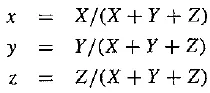
This effectively means that one value out of the set (x,y, z) is redundant, since we have
SO that Z = 1 – x – y
Values x, y are called chromaticities.
Effectively, we are projecting each tristimulus vector (X, Y, Z) onto the plane connecting points (1, 0, 0), (0, 1, 0), and (0, 0, 1). Usually, this plane is viewed projected onto the z = 0 plane, as a set of points inside the triangle with vertices having (x, y) values (0, 0), (1, 0), and (0, 1).
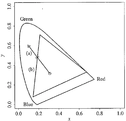
The following figure shows the locus of points for monochromatic light, drawn on this CIE “chromaticity diagram”. The straight line along the bottom of the “horseshoe” joins points at the extremities of the visible spectrum, 400 and 700 nanometers (from blue through green to red). That straight line is called the line of purples. The horseshoe itself is called the spectrum locus and shows the (x, y) chromaticity values of monochromatic light at each of the visible wavelengths.
The color – matching curves are devised so as to add up to the same value [the area under each curve is the same for each of x(X), y(A), z(X)]. Therefore for a white illuminant with all SPD values equal to 1 — an “equienergy white light” — the chromaticity values are (1/3, 1/3). The following figure displays this white point in the middle of the diagram. Finally, since we must have*, y < 1 and x-~ y < 1, all possible chromaticity values must necessarily lie below the dashed diagonal line. Note that one may choose different “white” spectra as the standard illuminant.
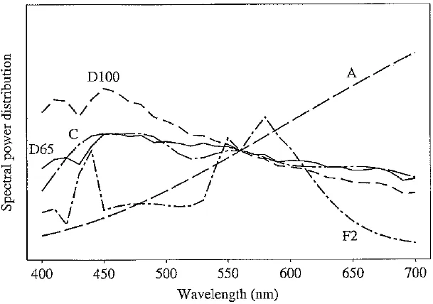
The CIE defines several of these, such as illuminant A, illuminant C, and standard daylights D65 and D100. Each of these will display as a somewhat different white spot on the CIE diagram: D65 has a chromaticity equal to (0.312713, 0.329016), and illuminant C has chromaticity
CLE chromaticity diagram
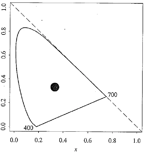
(0.310063, 0.316158). the following figure displays the SPD curves for each of these standard lights, illuminant A is characteristic of in can descent lighting, with an SPD typical of a tungsten bulb, and is quite red. Illuminant C is an early attempt to characterize daylight, while D65 and D100 are respectively a midrange and a bluish commonly used daylight.
Colors with chromaticities on the spectrum locus represent “pure” colors. These are the most “saturated”: think: of paper becoming more and more saturated with ink. In contrast, colors closer to the white point are more unsaturated.
The chromaticity diagram has the nice property that, for a mixture of two lights, the resulting chromaticity lies on the straight line joining the chromaticities of the two lights. Here we are being slightly cagey in not saying that this is the case for colors in general, just for “lights”. The reason is that so far we have been adhering to an additive model of color mixing. This model holds good for lights or, as a special case, for monitor colors. However, as we shall see below, it does not hold for printer colors.
For any chromaticity on the CIE diagram, the “dominant wavelength” is the position on the spectrum locus intersected by a line joining the white point to the given color and extended through it. (For colors that give an intersection on the line of purples, a complementary dominant wavelength is defined by extending the line backward through the white point.) Another useful definition is the set of complementary colors for some given color, which is given by all the colors on the line through the white spot. Finally, the excitation purity is the ratio of distances from the white spot to the given color and to the dominant wavelength, expressed as a percentage.
Standard illuminant SPDs
Color Monitor Specifications
Color monitors are specified in part by the white point chromaticity desired if the RGB electron guns are all activated at their highest power. Actually, we are likely using gamma – corrected values R’, G’, B’. If we normalize voltage to the range 0 to 1, then we wish to specify a monitor such that it displays the desired white point when R’ = G’ = B’ — 1 (abbreviating the transform from file value to voltage by simply stating the pixel color values, normalized to maximum 1).
However, the phosphorescent paints used on the inside of the monitor screen have their own chromaticities, so at first glance it would appear that we cannot independently control the monitor white point. However, this is remedied by setting the gain control for each electron gun such that at maximum voltages the desired white appears.
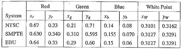
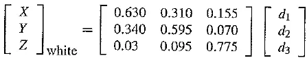
Several monitor specifications are in current use. Monitor specifications consist of the fixed, manufacturer – specified chromaticities for the monitor phosphors, along with the standard white point needed. The following table shows these values for three common specification statements.
NTSC is the standard North American and Japanese specification. SMPTE is a more modern version of this, wherein the standard illuminant is changed from illuminant C to illuminant D65 arid the phosphor chromaticities are more in line with modern machines. Digital video specifications use a similar specification in North America. The EBU system derives from the European Broadcasting Union and is used in PAL and SECAM video systems.
Table Chromaticities and white points for monitor specifications
Out – of – Gamut Colors
For the moment, let’s not worry about gamma correction. Then the really basic problem for displaying color is how to generate device – independent color, by agreement taken to be specified by (x, y) chromaticity values, using device – dependent color values RGB.
For any (.r, y) pair we wish to find that RGB triple giving the specified (x, y, z): therefore, we form the z values for the phosphors via z = 1 — x — y and solve for RGB from the manufacturer – specified chromaticities. Since, if we had no green or blue value (i.e., file values of zero) we would simply see the red – phosphor chromaticities, we combine nonzero values of R, G, and B via
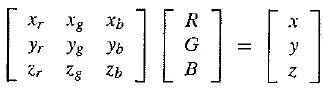
If (x, y) is specified instead of derived from the above, we have to invert the matrix of phosphor (x, y, z) values to obtain the correct RGB values to use to obtain the desired chromaticity.
But what if any of the RGB numbers is negative1? The problem in this case is that while humans are able to perceive the color, it is not representable on the device being used. We say in that case the color is out of gamut, since the set of all possible displayable colors constitutes the gamut of the device.
One method used to deal with this situation is to simply use the closest in – gamut color available. Another common approach is to select the closest complementary color.
For a monitor, every displayable color is within a triangle. This follows from so – called Grossman’s Law, describing human vision, stating that “color matching is linear”. This means that linear combinations of lights made up of three primaries are just the linear set of weights used to make the combination times those primaries. That is, if we compose colors from a linear combination of the three “lights” available from the three phosphors, we can create colors only from the convex set derived from the lights — in this case, a triangle. (We’ll see below that for printers, this convexity no longer holds.)
The following figure shows the triangular gamut for the NTSC system drawn on the CIE diagram. Suppose the small triangle represents a given desired color. Then the in gamut point on the boundary of the NTSC monitor gamut is taken to be the intersection of
· The line connecting the desired color to the white point with
· The nearest line forming the boundary of the gamut triangle.
Approximating an out – of – gamut color by an in – gamut one. The out – of – gamut color shown by a triangle is approximated by the intersection of (a) the line from that color to the white point with (b) the boundary of the device color gamut
White – Point Correction
One deficiency in what we have done so far is that we need to be able to map tristimulus values XYZ to device RGBs, and not just deal with chromaticity xyz. The difference is that XY Z values include the magnitude of the color. We also need to be able to alter matters such that when each of R, G, B is at maximum value, we obtain the white point.
But so far, Table would produce incorrect values. Consider the SMPTE specifications, Setting R = G = B — 1 results in a value of X that equals the sum of the x values, or 0.630 + 0.310 + 0.155, which is 1.095. Similarly, the Y and Z values come out to 1.005 and 0.9. Dividing by (X + Y + Z) results in a chromaticity of (0.365, 0.335) rather than the desired values of (0.3127, 0.3291).
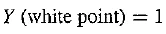
The method used to correct both deficiencies is to first take the white – point magnitude of Y as unity:
Now we need to find a set of three correction factors such that if the gains of the three electron guns are multiplied by these values, we get exactly the white point XYZ value at R = G = B = 1. Suppose the matrix of phosphor chromaticities xr, xg,… is called M. We can express the correction as a diagonal matrix D = diag (d1, d2, d3) such that
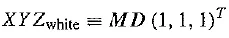
where ( )T means transpose
For the SMPTE specification, we have (x,y,z) = (0.3127,0.3291, 0.3582) or, dividing by the middle value, XYZ while = (0.95045, 1, 1.08892). We note that multiplying D by (1,1, l) T just gives (d1,d2,d3)T, and we end up with an equation specifying (d1,d2,d3)T:
Inverting, with the new values XYZ White specified as above, we arrive at (d1, d2, d3) = (0.6247,1.1783, 1.2364)
XYZ to RGB Transform
Now the 3 x 3 transform matrix from XYZ to RGB is taken to be
T =MD
even for points other than the white point:
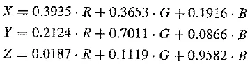
For the SMPTE specification, we arrive at
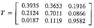
Written out, this reads
Transform with Gamma Correction
The above calculations assume we are dealing with linear signals. However, instead of linear R, G, B, we most likely have nonlinear, gamma – corrected R’, G”, B’.The best way of carrying out an XYZ – to – RGB transform is to calculate the linear RGB required by inverting Equation, then create nonlinear signals via gamma correction.
Nevertheless, this is not usually done as stated. Instead, the equation for the Y value is used as is but is applied to nonlinear signals. This does not imply much error, in fact, for colors near the white point. The only concession to accuracy is to give the new name Y’ to this new Y value created from R’, G’, B’. The significance of Y’ is that it codes a descriptor of brightness for the pixel in question.1
In (The Color FAQ file on the text web site, this new value Y’ is called “luma”. The most – used transform equations are those for the original NTSC system, based upon an illuminant C white point, even though these are outdated. Following the procedure outlined above but with the values we arrive at the following transform:
X = 0.607 . R + 0.174 . G + 0.200 . B
Y = 0.299 . R + 0.587 . G + 0.114 . B
Z = 0.000 . R + 0.066 . G + 1.116 . B
Thus, coding for nonlinear signals begins with encoding the nonlinear – signal correlate of luminance:
Y’ = 0.299 . R’ + 0.587 – G’ + 0.114 . B’
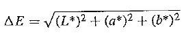
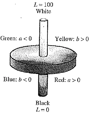
L*a*b* (CIELAB) Color Model
The discussion above of how best to make use of the bits available to us touched on the issue of how well human vision sees changes in light levels. This subject is actually an example of Weber’s Law, from psychology: the more there is of a quantity, the more change there must be to perceive a difference. For example, it’s relatively easy to tell the difference in weight between your 4 – year – old sister and your 5 – year – old brother when you pick them up.
However, it is more difficult to tell the difference in weight between two heavy objects. Another example is that to see a change in a bright light, the difference must be much larger than to see a change in a dim light. A rule of thumb for this phenomenon states that equally perceived changes must be relative. Changes are about equally perceived if the ratio of the change is the same, whether for dark or bright lights, and so on. After some thought, this idea leads to a logarithmic approximation to perceptually equally spaced units.
For human vision, however, CIE arrived at a somewhat more involved version of this kind of rule, called the CIELAB space. What is being quantified in this space is, again, differences perceived in color and brightness. This makes sense because, practically speaking, color differences are most useful for comparing source and target colors. You would be interested, for example, in whether a particular batch of dyed cloth has the same color as an original swatch. The following figure shows a cutaway into a 3D solid of the coordinate space associated with this color difference metric.
The L*a*b* color space includes all perceivable colors which means that its gamut exceeds those of the RGB and CMYK color models. One of the most important attributes of the L*a*b* model is the device independency. This means that the colors are defined independent of their nature of creation or the device they are displayed on. The L*a*b* color space is used e.g. in Adobe Photoshop when graphics for print have to be converted from RGB to CMYK, as the L*a*b* gamut includes both the RGB and CMYK gamut. Also it is used as an interchange format between different devices as for its device independency.
CIELAB (also known as L* a*b*) uses a power law of 1 / 3 instead of a logarithm. CIELAB uses three values that correspond roughly to luminance and a pair that combine to make colorfulness and hue (variables have an asterisk to differentiate them from previous versions devised by the CIE)’. The color difference is defined as
CIELAB model. (This figure also appears in the color insert section.)
where
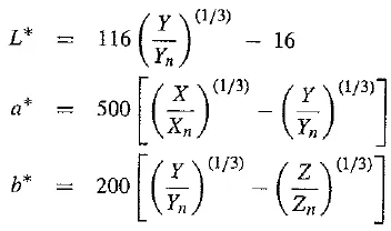
with Xn, 7n, Zn the XYZ values of the white point. Auxiliary definitions are
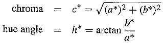
Roughly, the maximum and minimum of value a* correspond to red and green, while b* ranges from yellow to blue. The chroma is a scale of colorfulness, with more colorful (more saturated) colors occupying the outside of the CIELAB solid at each L* brightness level, and more washed – out (desaturated) colors nearer the central achromatic axis. The hue angle expresses more or less what most people mean by “the color” — that is, you would describe it as red or orange.
The development of such color – differences models is an active field of research, and there is a plethora of other human – perception – based formulas (the other competitor of the same vintage as CIELAB is called CIELUV — both were devised in 1976). The interest is generated partly because such color metrics impact how we model differences in lighting and viewing across device and / or network boundaries. Several high – end products, including Adobe Photoshop, use the CIELAB model.
More Color – Coordinate Schemes
There are several other coordinate schemes in use to describe color as humans perceive it, with some confusion in the field as to whether gamma correction should or should not be applied. Here we are describing device – independent color — based on X YZ and correlated to what humans see. However, generally users make free use of RGB or R’, G’, B’.
Other schemes include: CMY (described on p. 101); HSL — Hue, Saturation and Lightness; HSV — Hue, Saturation and Value; HSI — and Intensity; HCI — OChroma; HVC — WValue; HSD — D = Darkness; the beat goes on!
Munsell Color Naming System
In colorimetry, the Munsell color system is a color space that specifies colors based on three color dimensions: hue, value (lightness), and chroma (color purity). It was created by Professor Albert H. Munsell in the first decade of the 20th century and adopted by the USDA as the official color system for soil research in the 1930s.
Several earlier color order systems had placed colors into a three – dimensional color solid of one form or another, but Munsell was the first to separate hue, value, and chroma into perceptually uniform and independent dimensions, and was the first to systematically illustrate the colors in three – dimensional space. Munsell’s system, particularly the later renotations, is based on rigorous measurements of human subjects’ visual responses to color, putting it on a firm experimental scientific basis. Because of this basis in human visual perception, Munsell’s system has outlasted its contemporary color models, and though it has been superseded for some uses by models such as CIELAB (L*a*b*) and CIECAM02, it is still in wide use today.
Accurate naming of colors is also an important consideration. One time – tested standard system was devised by Munsell in the early 1900’s and revised many times (the last one is called the Munsell renotation). The idea is to set up (yet another) approximately perceptually uniform system of three axes to discuss and specify color. The axes are value (black – white), hue, and chroma. Value is divided into 9 steps, hue is in 40 steps around a circle, and chroma (saturation) has a maximum of 16 levels. The circle’s radius varies with value,
The main idea is a fairly invariant specification of color for any user, including artists. The Munsell corporation therefore sells books of all these patches of paint, made up with proprietary paint formulas (the book is quite expensive). It has been asserted that this is the most often used uniform scale.


Comments are closed