Most people find it much easier to comprehend graphs and curves rather than assimilating raw data which is bit unintelligible at times. Hence if you do not the dry discussion about the electricity tariffs, factors affecting tariffs and the significance of these factors; just read this article to know about a few types of graphical representations of those data parameters which are important for a power generation company. We will consider three types of graphs and curves in this article as follows.
Chronological Curve
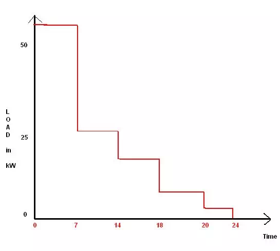
There is an average load on the power station in a given time period which could be set depending on the load variation. If this load on the power supply station is plotted against the time periods in which these loads occur, it gives rise to what is known as the chronological curve because of the chronological appearance of the power demand along the time sequence.
You can take a look at one such curve in the adjacent diagram which shows such a curve where the average load is plotted along the y-axis while the time frame of that average load comes in the x-axis. So as you can see in the diagram the load is maximum between the time periods of 5pm to 12 midnight, while it is lowest in the time period of 1pm to 5pm. This is just an imaginary graph to give you an idea about the load curve and does not represent any actual data.
Needless to say this data representation is extremely important for the power generation company as it helps to forecast the size of the generation equipment as well as to understand the load variations during the day.
Load Duration Curve
If the above variation given in chronological order is given in order of the size or magnitude of power consumption, the curve in such a case is known as load duration curve. For example if we simply rearrange the bars of the above bar graph in such an order that the highest demand comes first, and so on; we get what is known as the load duration curve.
Also note that instead of specific time periods like load curve, the load duration curve gives total time period. This means to say that for example instead of 5pm to midnight now we put simply 7 hours which is just the same though. This curve immediately gives an idea about the number units of power consumed during the day as well as their consumption during various time periods.
Load Energy Curve
As the name itself suggests, the load energy curve is a graph between the load that is on the power plant vs. the energy that is produced at or below that load for a given power generation plant both being taken in the same units of kW. Usually the load is plotted along the vertical axis whilst the energy goes along the horizontal or the x-axis. The method of drawing this graph is to the use the previously discussed bar chart namely the load duration curve.
Let us understand this in the following manner
There are four points on the curve represented by u, v, x and y respectively.
For the point “u” we have lowest average power from the load duration curve and multiplied by the number of hours against it which means 24.
Similarly we go on taking the next higher load and the lesser number of hours that it corresponds to. These points are then joined together by a straight line to get the graph as shown in the adjacent sketch.
In the next article we will study the types of tariffs associated with electricity supply.